Wake up, work, sleep, lather, and repeat – for a long time we have continued this cycle in our day-to-day life, rarely stopping to look at the world around us and the impact we make on it until the pandemic brought us to a staggering halt. The lack of outside distractions helped increase the focus on the inside – our home and our lives. This time period was when my love for plants really flourished! Looking for the idyllic ways to make my dream house come true, my research brought me across these truly beautiful architectural designs with indoor gardens. Your space can be big or small, these inspirational designs are sure to be great additions to your Pinterest boards.

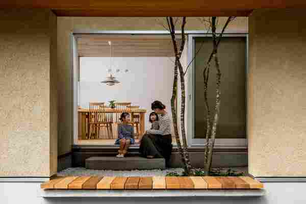
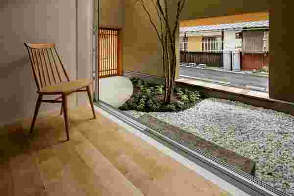
A simple home in Shiga gets elevated with an indoor garden, that extends upwards to become a sunlight. Designed by Hearth Architects , the Kyomachi House is located in Koga, Japan. The skylight covers a curved patch in the center of the space and the tall plants provide the residents with privacy from the street and providing natural ventilation. “It plays a role as a sunshade in leafy summer and as letting the sunshine in non-leafy winter,” said the studio. “The clients can enjoy the change of the seasons and time through the symbolic tree. There is a symbolic deciduous tree in the inner garden, which is visible from anywhere inside.”
“If you don’t listen to the world with an open heart and head, if you don’t pay attention to what’s going on around you, what the air smells like, what people say, the world starts dictating its rules, cruel rules,” says Serhii Makhno. Bunker project is a trip to a depth of 15 meters and below. It is an autonomous underground house that has several layers: a living space, a floor with a water treatment system and generator, a layer of electrical equipment, and at the very bottom — a well. With indoor gardens and the sky, this design by Sergey Makhno Architects keeps you safe.
An opening in the roof sheds light on this concrete-lined boutique in São Paulo, which Brazilian studio Vão Arquitetura has designed around a lush indoor garden. The Acolá store, located in the Pinheiros area of the city, is set inside a peculiarly shaped townhouse, which gets narrower towards its rear. Before their renovation, the Vão Arquitetura team described the three-storey space as being damp and dark – with only four windows running along its main facade.
Dandelion Chocolate, a San Francisco based chocolatier has created a cafe and shop in a century-old house in Kyoto, Japan. Kyoto being the heritage capital of Japan, this shop is designed in harmony with the surroundings and comprises of a cacao bar where customers can order pairings of alcohol with chocolate desserts, a shop, and a traditional Japanese courtyard garden. “Considering the parallels between craft chocolate and cedar, both require authentic craftsmanship and carefully selected natural ingredients – so I made the decision to place cedar at the center of materials used for this project,” said Fumihiko Sano , who began his career as a Sukiya-Daiku – a carpenter for traditional teahouses. Sano san opted to use cedarwood and retain a moment of tranquility and calm in the oasis of the touristy space by adding a traditional Japanese courtyard garden to the design.
A “dark green geometric volume” with its punctured roof opening to a green area defines a small design studio, ASWA (Architectural Studio of Work – Aholic), located in Bangkok, Thailand. The studio sits on a small land, around 100 m2 that previously used as parking lots. The design uses corrugated sheets to create this minimal structure in this off-center courtyard that is determined by the required width and height of the surrounding spaces regarding their functions, which include working space for 6-8 staff, a meeting area, a displayed physical models, materials cabinets, and restroom.
It is known that the best way to uplift a drab-looking office space is with plants, but the architecture and urbanism studio jvantspijker & partners have taken the idea one step ahead by redesigning a former steam factory and added in a central meeting room topped with plants! This quirky addition to the office is an attention seeker with a small flight of stairs leading up to the garden that provides a space to relax in. ‘The central design idea behind the transformation of the office was to keep the scale, transparency, and lightness in place and to connect the office to the main atrium of the building‘, explains the design team. ‘Therefore the central element was designed as a hybrid between a room, a wall, and a piece of furniture; it divides, connects, and provides service space.’
This “wholesome” structure is a multi-generational family home in the city of Bien Hoa, Vietnam designed by CTA Creative Architects and the only thing they wanted was the living spaces to feel bright and airy. “According to recently published scientific research, indoor air quality is worse than outdoor air quality. Therefore, most of our discussions with the house owner tended to the idea of a house that is able to ‘breathe’ 24/7 by itself,” said the team. Most of the structure’s exterior is covered in perforated square bricks that allow fresh air and natural light to flood in. It also promotes upcycling in design – all of the bricks were salvaged from the building sites of properties nearby and were then punctuated to make four small holes in each of them. Material reusability is as important as creativity. To further add to the natural breathing feeling, a small “garden” was planted around the periphery of the main room which makes the air quality better and also acts as a much-needed soothing contrast to the brick tones.
Studio CORE architecture set up the headquarters for EBIL, with a goal to create an every-efficient building. The tools used by the architect? A raw concrete facade in contrast with lush greenery inside the office space that creates a relaxing oasis while joining the two buildings.‘we believe that only designing for energy efficiency is not enough,’ explains the CORE team. ‘how does one ensure that the users adapt to the design? here we experimented with the psychology of the users.’ the elevator shaft is taken far from the work areas and the access travels through senior management works spaces — this discourages the users to use the elevator and instead, prefer the tropical hillock connecting all the spaces.